re:publica 2019
tl;dr
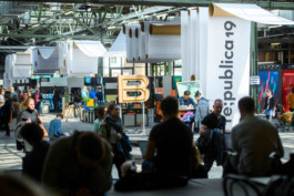
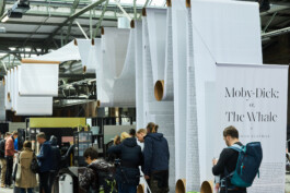
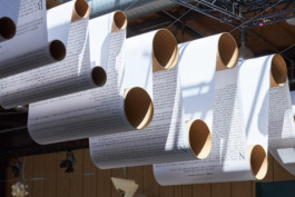
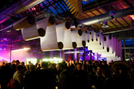
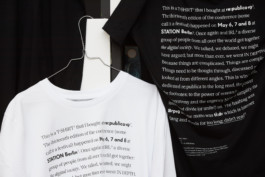
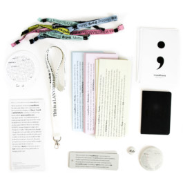
re:publica is Europe’s biggest conference for the digital society. This year’s motto was »tl;dr«, which is internet slang for »too long; didn’t read«. The conference wanted to tackle the dangers of simplifying and shortening information online. Focussing on the importance of the longread we created an entirely typographic visual identity. On every item appearing at the event we explained the intentions and topics of the conference in simple, but poignant text. In addition to that we created a 450m long installation of Moby Dick – a book which few have read but many think they know what it is about.
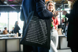
The design concept was applied to re:publica’s website, stages, brochures, posters, animated films, merchandise and wayfinding.
Client
re:publica GmbH
In collaboration with
Architecture: Mathias Lücking, Pia Steinhardt
Motion Design: JUTOJO
Sound Design: Owen Lloyd
Photos (CC BY 2.0)
Shinji Minegishi, Jan Michalko, Gregor Fischer, Jan Zappner, Stefanie Loos
Shortlisted for Dezeen Awards 2019

