re:publica 2016
TEN / NET
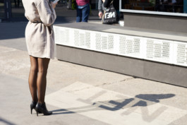
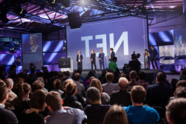
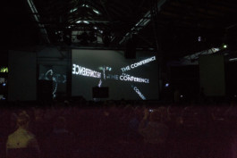
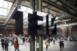
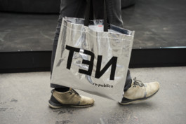
In 2016 re:publica staged the 10th edition of what had become one of the largest and most important real life gatherings of the digital society. The festival wanted to reflect on a decade of life on the internet, and reflection is what we took literally creating a celebratory visual identity which gravitates towards a logo that spells out TEN and NET at the same time. The task was to represent an event which had grown up without loosing its depth, wit and unconventional mindset.
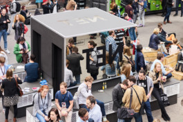
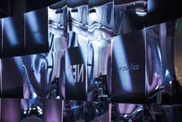
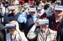
On site the design was realized with a plurality of reflecting surfaces contrasting the color black which was never before used prominently by re:publica. For the courtyard we designed a walk-in cube with walls made out of so-called spy mirrors which let visitors hide inside while spying on others outside of the cube. The cube functioned as a commentary on internet privacy culminating in the then ongoing NSA scandal.
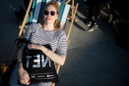
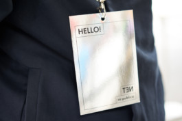
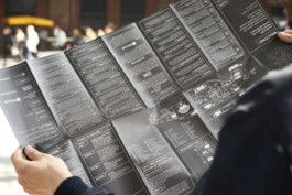
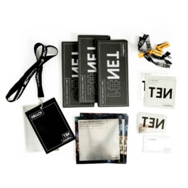
Beyond that the identity took form in a new website, brochures, posters, animated films, merchandise and wayfinding. In 2017 the project was awarded by the German Design Council.
Client
re:publica GmbH
In collaboration with
Architecture: Mathias Lücking
Motion Design: JUTOJO
Sound Design: Ville Haimala
Photos (CC BY 2.0)
Jan Zappner, Jan Michalko, Gregor Fischer, fertig design
Awarded by the German Design Council

